Speeding up document workflows
for 50k businesses
New extension for PandaDoc
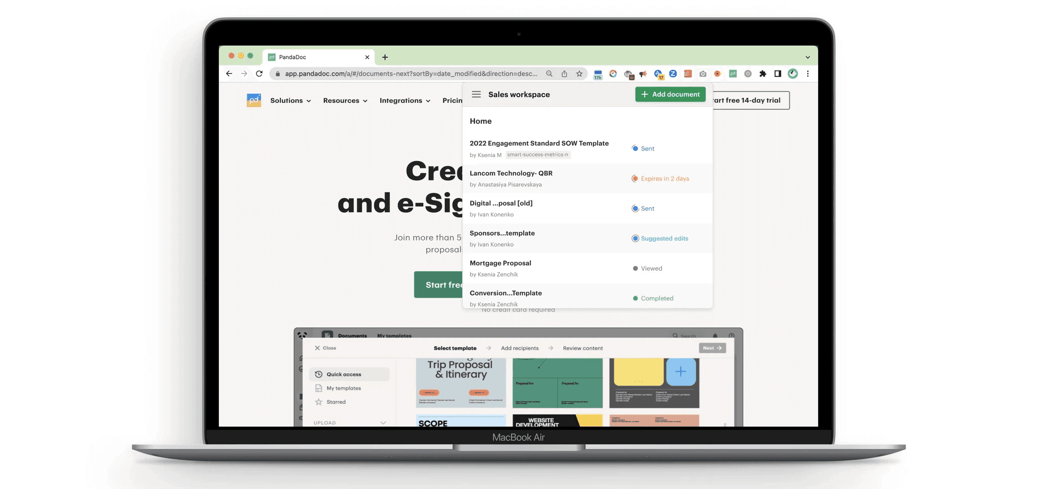
PandaDoc is a document automation software to streamline the process to create, approve, and eSign proposals, templates and contracts. PandaDoc is the #1 proposal, contract and document solution by G2.
My Role
Senior Product Designer
Input
User Research Product Strategy
UI & UX Design Prototyping
Industry
B2B SaaS
Date
Summer 2023
OPPORTUNITY
Increasing a number of paid users
Our Growth team's quarter goal was to find new effective acquisition channels of paid users. Developing Google Chrome extension was one of the growth design initiatives to support this goal.
We wanted to build an extension that would serve as a valuable asset for current users promoting paid features and also will help us attract new users from the marketplace.
TL;DR
- I designed extension for our current 50k clients 0->1;
- Expanded the design system with new patterns for a new medium;
- Created a faster way to start document workflows for our free and paid users.
RESEARCH INSIGHTS
“Have they already reviewed my proposal?”
Every successful sales rep tracks the updates of their proposals and materials shared. Ideally, they even track it real time and react as quickly as possible. Why? If a client opened a doc dozens of times and never got back – it may be the right time to offer them help.
Users were confused with a number of emails with updates PandaDoc sent. It was hard to track the fate of individual documents in the product as well.
“I need to draft the docs real time during the calls”
Timing is of essence for sales and marketing reps. They often draft docs as they go over the requirements and solutions with the clients on the call. Navigating clunky and feature heavy desktop web app is not ideal for quick start of doc generation.
“There are too many templates and I usually need a few”
Some users needed to find a template quickly as they were drafting the document.
Usually, there were dozens of templates and finding the right template required extra energy and attention while they were talking to a client at the same time.
DESIGN EXPLORATION
Listing user stories
Based on the research findings, I collaborated with a dedicated product manager and prioritized a list of features in the extension.
The extension should allow users to:
Upload the documents (docx, pdf, pptx),
Start documents from the current templates,
Review latest status updates in regards to their documents,
View all documents and their statuses.
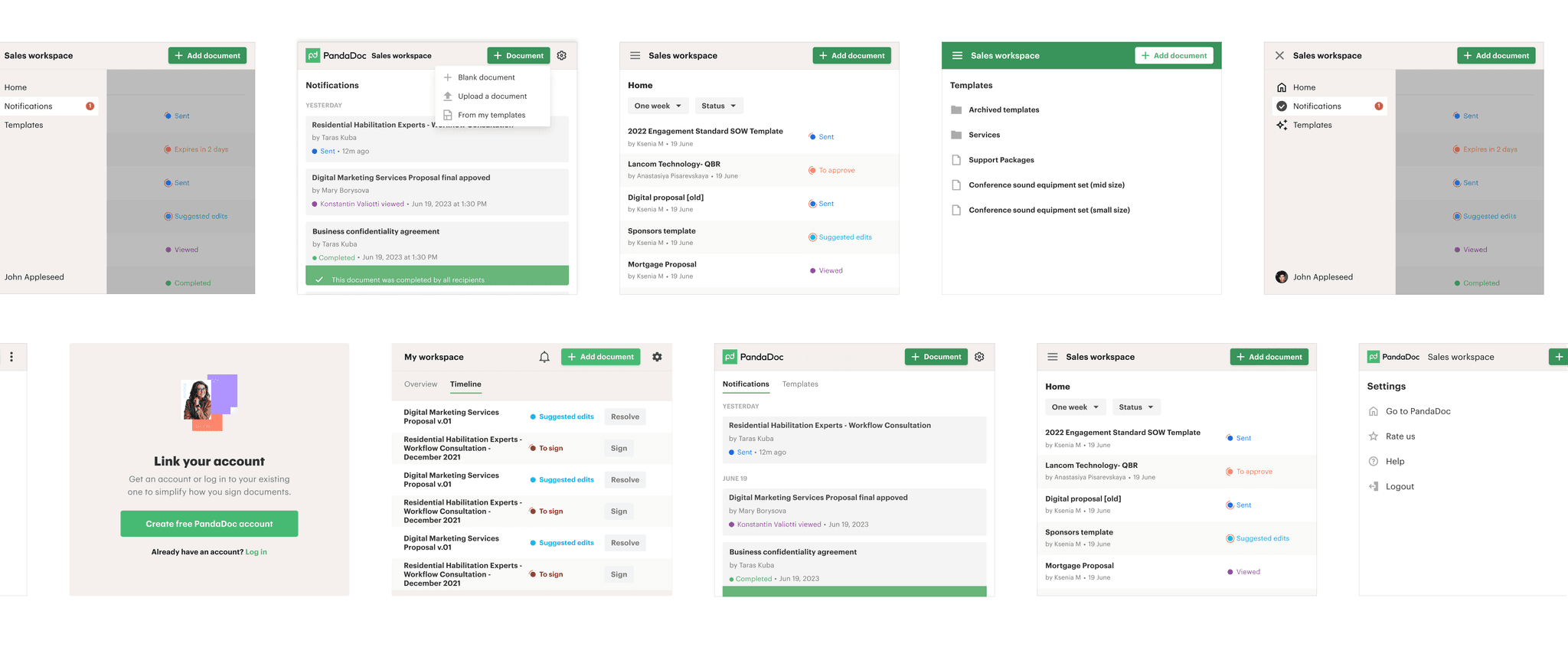
I wireframed dozens of possible designs to consider as many solutions as possible.
I have cosidered different types of navigation between the dashboard and the notifications, various levels of detailization of the document status and entry points to start a new document.
Design explorations
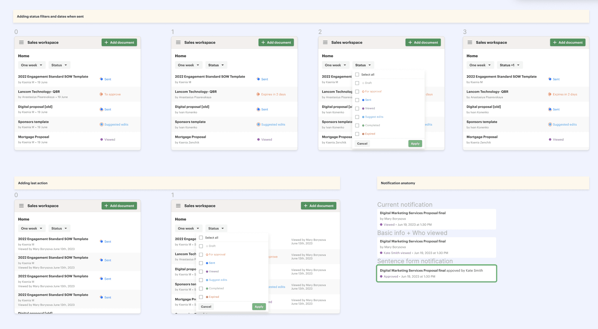
A dashboard with all documents and their statuses could have been simple and focus on the core information or rich incorporating filtering by status, date or action required.
After exploring several options with my PM, we agreed to keep it uncomplicated in the first iteration and distribute dev resources as we see ROI from the extension later on.
Just a few explorations of dashboard and notifications out of many to arrive at the optimal design solution
Drafting and testing first concepts
To support the functionalities, I have used a side menu navigation and a top menu bar. Top menu bar allowed user to upload a new document, or start from blank. If users wanted to explore templates and start a document from a template, they could access it from the side menu.
Course correction, captain
"What is this dashboard for?"
After usability testing, it turned out that users didn’t really see big value in reviewing the statuses of all docs, as they tried to react asap after the document was signed or viewed.
Notifications: "Good start, keep going"
Notifications were regarded as helpful yet we were missing the crucial details. Users mentioned that they would need to dive deeper to see the time stamp.
"Where is my template?"
Templates were considered useful yet users wanted to jumpstart work with their frequently used templates rather than searching for the needed ones. I designed a feature of “starred” templates for quick access to their most commonly used templates on top.
FINAL SOLUTION
Simplified and clear
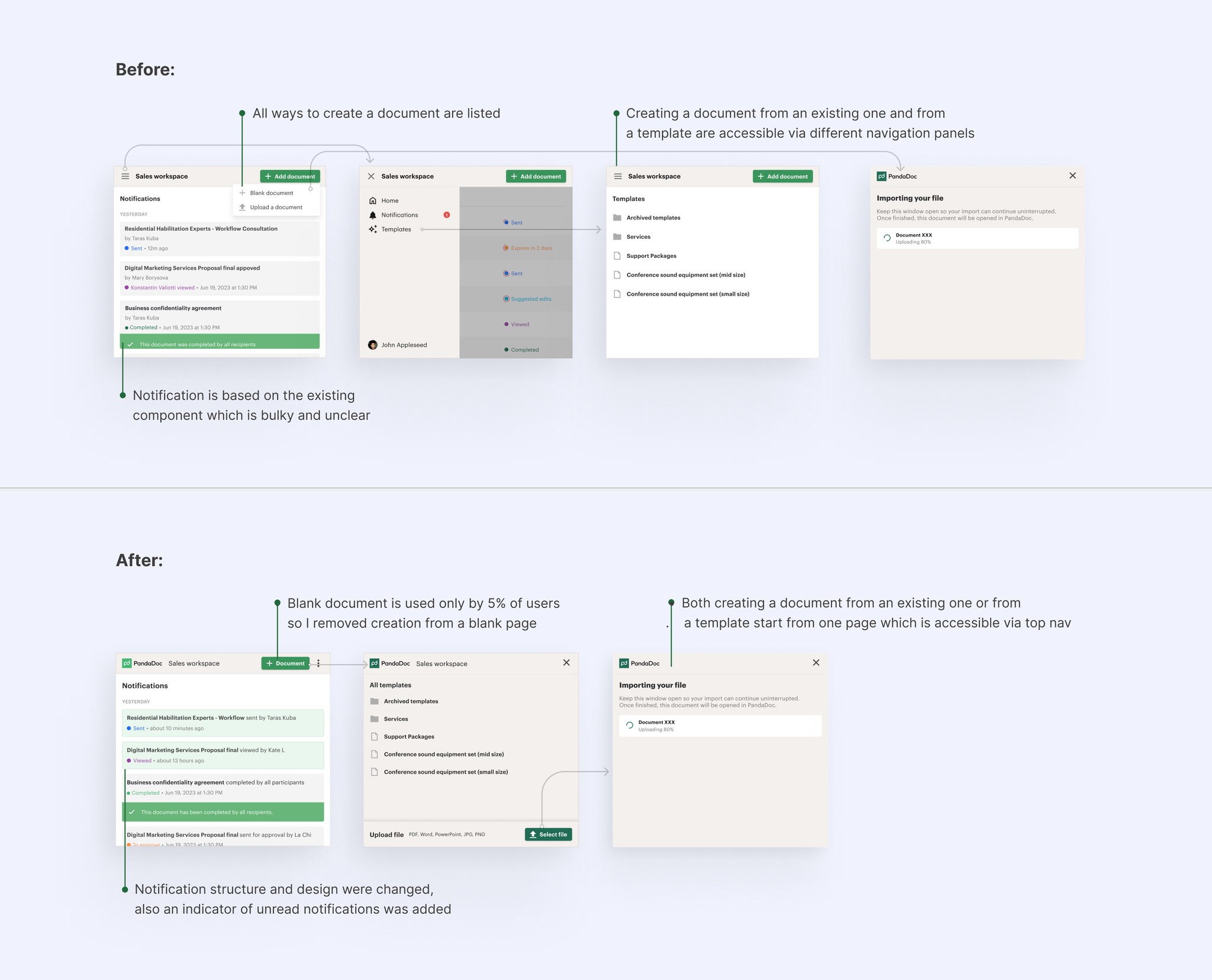
The desktop product already had a number document status notifications and to keep dev resources low for this project, I aimed at reusing the current components as much as possible. However, based on the research I needed to improve the UX of these notifications. I turned them to a sentence format for clarity and saving space due to small viewport of the extension.
I removed the dashboard page not perceived as valuable by users and redesigned navigation for simplicity and speed:
Divide and conquer: project stages
After discussions with developers we decided to move “rich” notifications feature including the details users requested such as how much time viewer spent in the document to version 2 since it required a lot more resources.
I designed a feature of “starred” templates for quick access to users' most commonly used templates on top. This feature was added to version 3 of the extension.
More than just product design
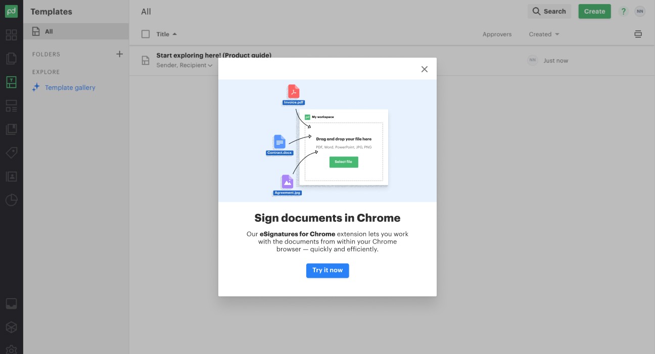
I recognized the importance of the Chrome Extension marketplace and content strategy for our PandaDoc Extension. I collaborated with marketing and branding teams to ensure that our messaging and branding aligned with our product.
Rolled out to beta testers
The PandaDoc Extension is an ongoing project. This extension was rolled out to a small cohort of active users, the team will collect the data and make decisions on the next steps based on the market traction and feedback.
Metrics to be monitored further:
- Retention to the extension;
- Number of new accounts coming from the extension source;
- Conversion to paid of the new and current accounts coming from the extension source.
My personal learnings
As designers, we need to keep in mind the holistic ideal picture of the product – and then think of practical steps to iterate, test, enhance and move on.
This project as many growth initiatives was aimed at getting quick results and moving iteratively. I practiced the art of dividing the project scope and planning the next granular releases to increase business velocity.
Next project:
